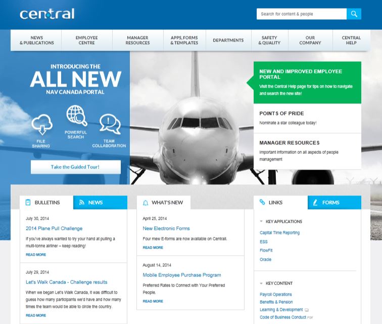
Intranet Design: Less is More

“I only use the intranet when I have a purpose. I go on to find something as quick as possible and then I’m off,” said an employee during an intranet focus group earlier today.
Employee focus groups that test intranet design concepts and approaches are very revealing. It’s a fantastic means of determining the collective opinion and requirements of the intranet and other digital workplace tools. However, despite the stunning advance in technology and approaches, one over-arching employee requirement is still more important than all others: less is more.
No scrolling
Per the employee who very succinctly summed-up the collective wisdom and consensus of most employees, in hundreds of intranet focus groups over the past 20 years, employees don’t surf the intranet, they want something very specific — and then they’re off. As such, the home page must be simple and easy to digest at a glance. The days of long scrolling pages for the sake of ‘information scent’ are long gone. Scrolling pages are good on the Internet, but not for the intranet home page. Some users don’t mind a little scrolling on the home page, and a lot of links; these are power users, and they’re in the minority.
And no, employees don’t mind scrolling when scanning long documents or pages of the desired content they seek. However, no one goes to the intranet home page thinking, “Hmmm, I wonder what’s going on today. I better hustle back to my desk and surf the intranet.” Employees go to the intranet for one reason: something specific. And they want it fast.
It’s not rocket science: less is more. If you undertake the research, or hire an independent intranet consultant to do so, employees will tell you what they want. And you can use the opportunity to test different design concepts and showcase other intranet designs. A simple home page at a glance, with more links than pictures and colors. But not too many links, or too much text. But more white space than you think or what you’d apply to a consumer-grade website.
Employee Insights
Here are some other key quotes from today’s focus group that I’ve heard repeated time and time again in countless focus groups over the years:
- There’s a lot of information. And some of it is a few years old. Some of it is not up-todate.
- I was looking for an organization chart and couldn’t find it. A lot of stuff is outdated or missing.
- A little unorganized. It would be helpful if everything was in one place (not in multiple intranet sites and repositories).
- I think it would also be beneficial to have internal news too. Right on the home page (instead of just external news and press releases).
- Most people want to navigate the site instead of relying on search.
- I hate the search.
Very telling. Intranet 101. Less is more; fix the content; fix the search. And not a single employee requested multimedia, social media, Slack or Yammer.
